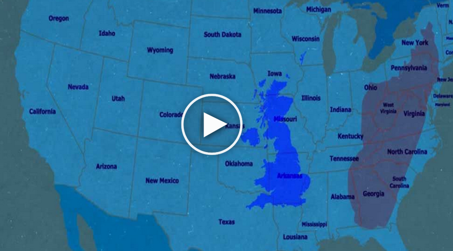

Most of us are taught at a young age that map projections distort the world’s reality. That said, how often do we really think about the ramifications that may have to our perceptions? During the cold war, for example, the common Mercator projection map depicts the USSR as a massive sprawling land mass that appears to be nearly 5-times the size of the United States. In this light, it helped paint them as a big red monstrous threat, when in actuality, Russia is not even twice the size of the U.S.
It’s the same reason why Greenland looks like it’s almost the same size as Africa, and why most people would assume the U.K. is bigger than Madagascar. Did you know that the U.S. is almost the exact same size as the Sahara Desert? The video below details why the information on maps can often be misleading, and though most everyone knows that a map’s images are distorted, the lengths to which it happens might be surprising, or are at the very least provide some interesting food for thought. Let us know what you thought of this fascinating map in the comments below.
[video_player]